


Имя или псевдоним
Arhil
Сопроводительный текст
Вступительные титры к фильму Донни Браско. В чем прикол такого кернинга?
Рецензировал
/64/kulinkovich.jpg)
Рецензировал
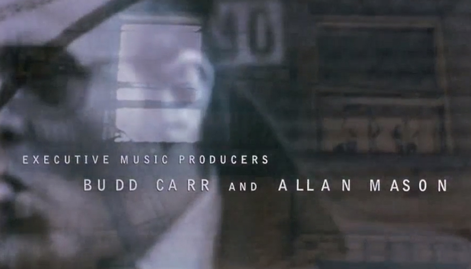
Расстояние между буквами — это один из множества параметров, которыми можно характеризовать работу дизайнера. Такой же, как
и шрифт, размер, цвет текста, интерлиньяж, музыка, анимация и так далее. Дизайнер создает образ и настроение путем подбора нужной комбинации этих параметров.
и шрифт, размер, цвет текста, интерлиньяж, музыка, анимация и так далее. Дизайнер создает образ и настроение путем подбора нужной комбинации этих параметров.
А брать потом один из параметров и пытаться интерпретировать
его значение можно бесконечно долго:
его значение можно бесконечно долго:
«To come up with the sequence, Cooper accessed surveillance-type photography used for the film and then experimented with the kerning of his font to create a stylish title design that both introduced us to his characters while establishing Johnny Depp’s outsider status before the movie even begins».
Filmmaker Magazine.
The art of Kyle Cooper
Filmmaker Magazine.
The art of Kyle Cooper
«The credits drift on and off in delicate white all-capped sans serifs that are oddly kerned in a subtle indication of subterfuge and imbalance».
Andrea Codrington.
Kyle Cooper
Andrea Codrington.
Kyle Cooper
«Here we have the opening credits for Donnie Brasco (1997) starring Johnny Depp which used „surveillance-type photography and kerning fonts...which hinted at the character’s obsessions and the story of the Mafia’s descent into hell“ (221).
The font face is fairly simple, but the uneven kerning (space between each letter) ages the look and adds raw texture, similar to the stereotypical typewriter lettering on a police record».
Caroline Yi.
Sans the Comic Sans
The font face is fairly simple, but the uneven kerning (space between each letter) ages the look and adds raw texture, similar to the stereotypical typewriter lettering on a police record».
Caroline Yi.
Sans the Comic Sans
«The first titles come up, with irregular kerning separating the letters.
(A comment from Art
of the Title Sequence calls it „uncanny“ and suggests that this
is indicative of familiar things being, at second glance, not quite right.)».
Mike Lim.
The titles. Then Donnie Brasco tries to make contact
(A comment from Art
of the Title Sequence calls it „uncanny“ and suggests that this
is indicative of familiar things being, at second glance, not quite right.)».
Mike Lim.
The titles. Then Donnie Brasco tries to make contact

